

Everyone is constantly connected to their mobile devices. Prioritizing design for mobile in our goal, focusing on the user experience that people get when they’re on mobile.

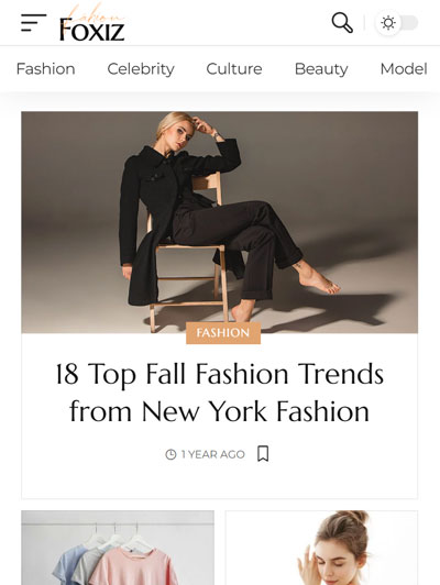


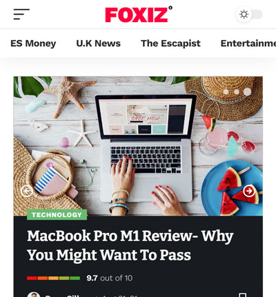
Settings for Mobile & Tablet
Many features have mobile, tablet, and desktop settings. Include: columns per row, spacing, grid gap, manage entry meta, typography and much more.
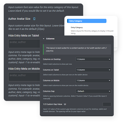
Readability, images load fast, minimize user effort for touch on elements and consistency design between mobile and desktop.Foxiz has everything for mobile-friendly websites.
Performance matters to the website's success. AMP is a good tool available to you to help you achieve great performance and optimize user experiences on the mobile.
Foxiz lets you customize your site on the mobile with the live editor. With unlimited options you can choose from to make your site unique and beautiful on the mobile.
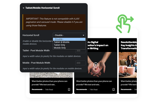
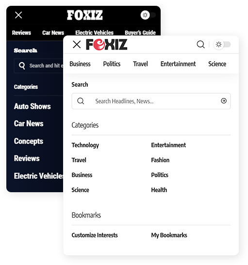
This unique feature sets Foxiz apart, providing users with easy navigation that effortlessly encourages exploration across a diverse spectrum of topics—all at your fingertips with a simple swipe.
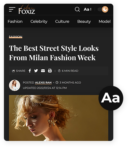

Flexible Layout
Allows you to convert a grid layout to the list view on the mobile or vice versa. Prevent overscrolling by making pages shorter. Make it easier for your visitors to scan the website content.
Join thousands of publishers running fast, beautiful magazine sites. Backed by a 14-day money-back guarantee.
Get Foxiz Professional